Have a project you’d like to collaborate on? Get in touch at dan@dan-marston.co.uk
© Dan Marston 2024
As the design manager for CardsChat it was my responsibility to implement design processes, hire an excellent team and deliver exceptional design work to transform the user experience.
Three major projects were undertaken during my time here; a platform migration of the community, a redesign of all educational content, and a complete rebrand.
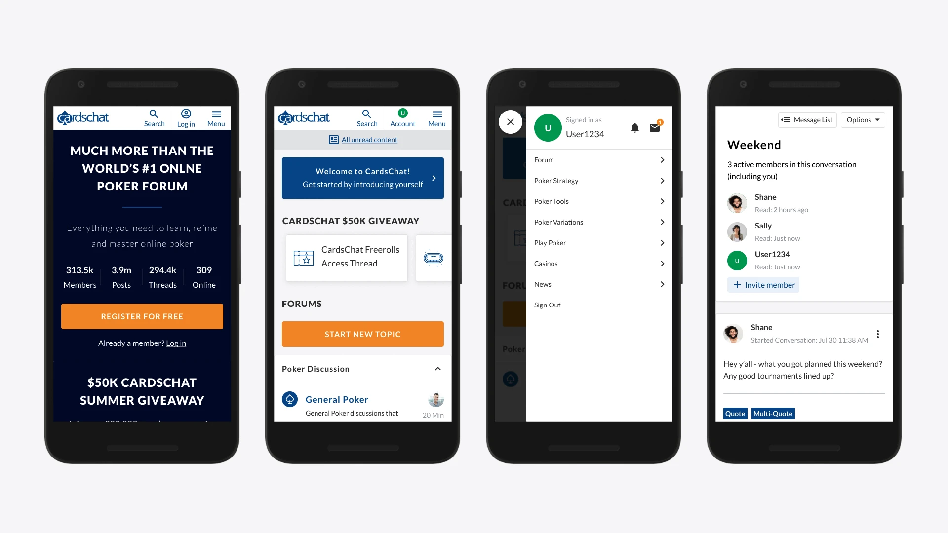
The forum platform had become very outdated, from a technical and experience perspective, and to grow the business something new was needed. I worked within a cross-functional team to asses off the shelf options for a migration, reviewing each user flow to understand the baseline experience and highlight areas where improvements could be made for our purposes.
To get a better understanding of the impact of these changes on the community, working alongside our researcher, I created several mobile prototypes and recruited forum members for a few rounds of user testing. This lead to changes to the experience being made including a streamlined log in and sign up flow, and custom components on the dashboard to help users find their most important threads.
After this migration project, we saw improvements in many key metrics, from new user acquisition to engagement across the forum, as well as lots of positive feedback from users.
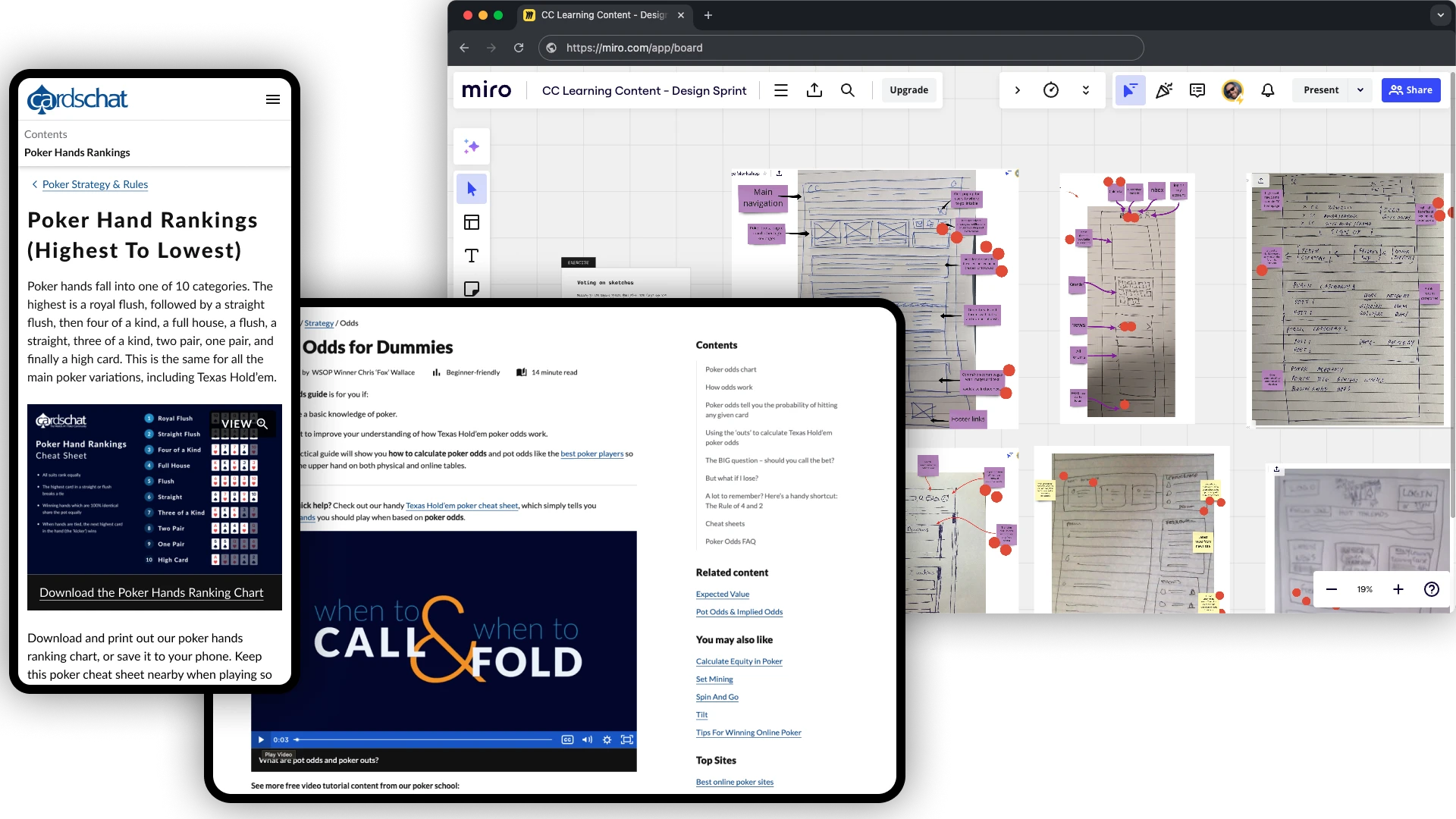
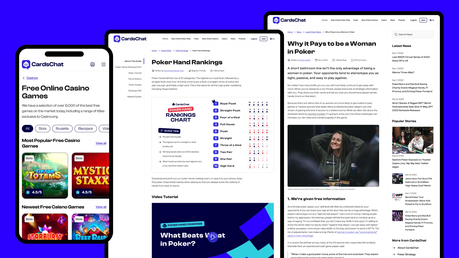
One area of the product that had seen very little improvement, but was so important to driving commercial traffic, was the poker and casino educational content. This was an area the product, design and content teams really wanted to take to the next level, so we ran a season long discovery and design process with a cross functional team to tackle it.
After extensive research, including on site surveys, quick split tests and user interviews, myself and another designer hosted a remote design sprint. The output of this sprint were a few prototypes to test and validate, as well as several a/b tests to run in the more immediate term.
Through this process we were able to deliver a much more refined and consistent experience, helping users find the information they were looking for. The impact was seen through improvement in engagement, time on site, and pages per visit; users were now far more likely to take time browsing through multiple pages and ultimately convert into commercial users.
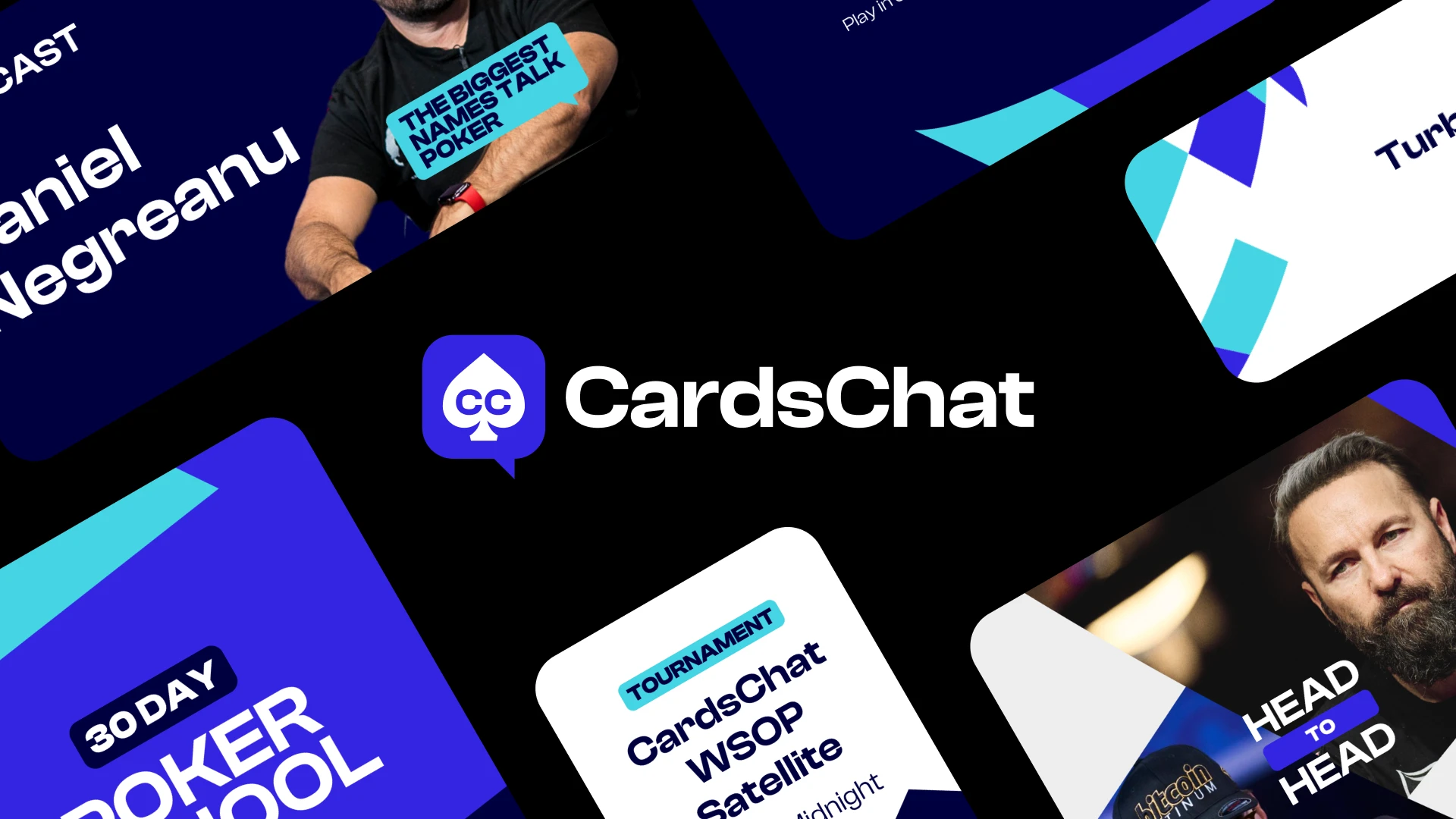
Something I had been very keen to do since joinign the product was give the brand a complete overhaul. We were missing a coherent brand strategy, no defined tone of voice and a very inconsistent look and feel. Whilts some work had been done through the previous projects to define a better visual design, I felt a full rebrand would set the product up for more future growth.
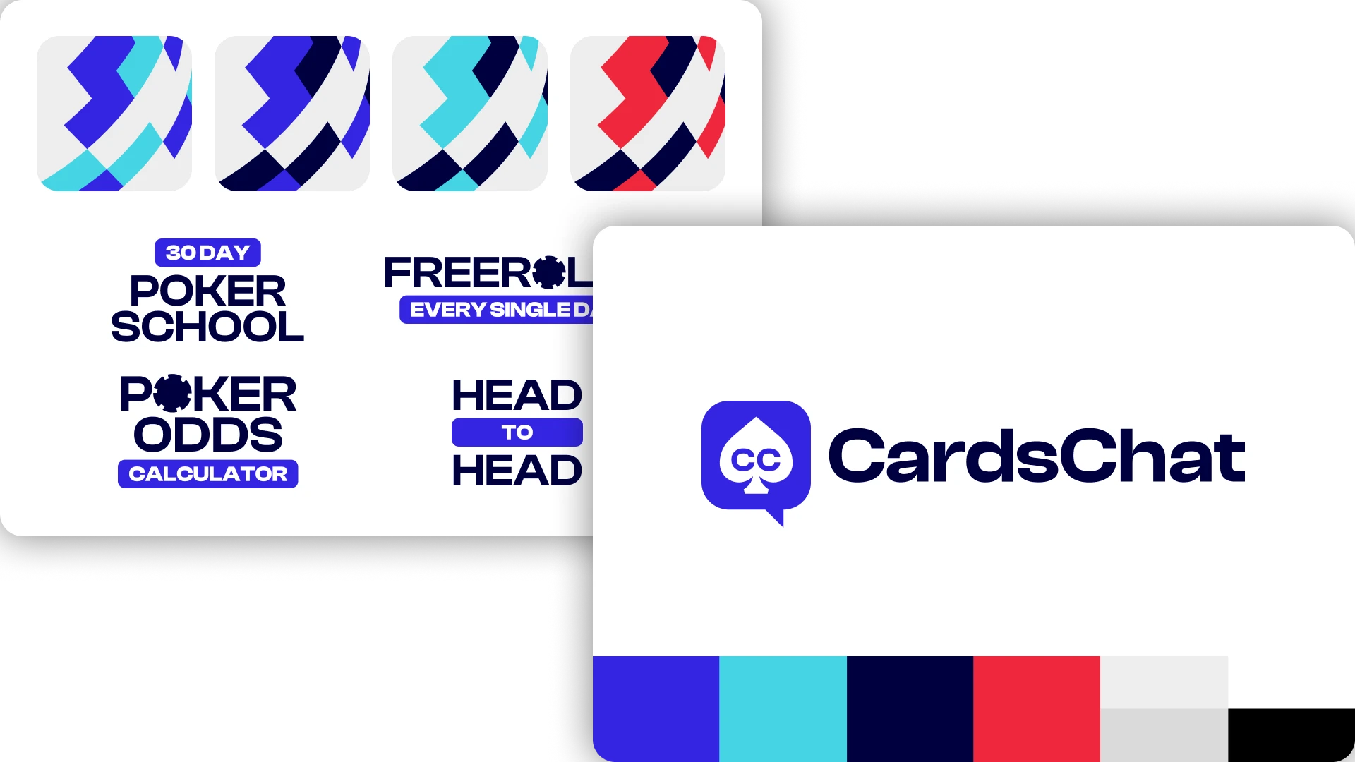
After finding an agency to partner with it was very important to me that we had a collaborative process to this rebrand. We needed a brand toolkit that could be used by various people within the team, across multiple future campaigns, and be something that felt genuine to poker. Working with the agency we conducted workshops in which we outlined the strategy, brand idea, narrative and values that would be the foundation for the creative work going forward.
With this in place we began work on the visual execution. I supported the agency by collecting feedback from the team asynchronously to drive forward iterations of the assets. I also mocked up applications of the brand-in-progress on our site to assist with this process. All of this combined enabled us to quickly reach sign off from our stakeholders for delivery of the final brand system.
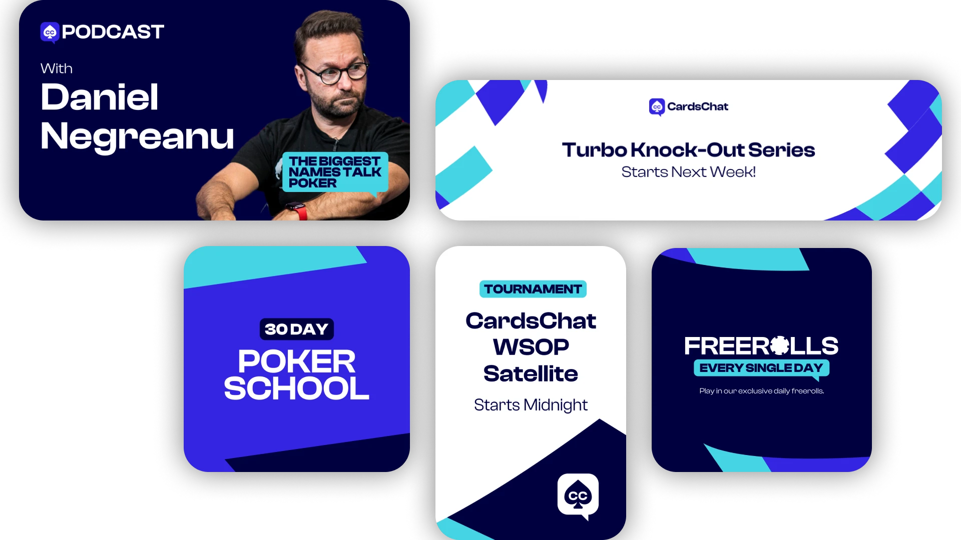
This started with the creation of a Canva library for our forum admins and moderators, many of whom are volunteers and don’t have the time or experience to create assets from scratch using a guideline. I created a set of around 30 templates for use across all our social media platforms, as well as banners for community events and the VIP program. Internal assets were also needed including presentation templates in Powerpoint, Google Slides and Miro, and branding elements for other company tools.
To consolidate all of this I built a Notion brand hub, summarising all guidelines and created assets, giving everyone in the company easy access to the resources.
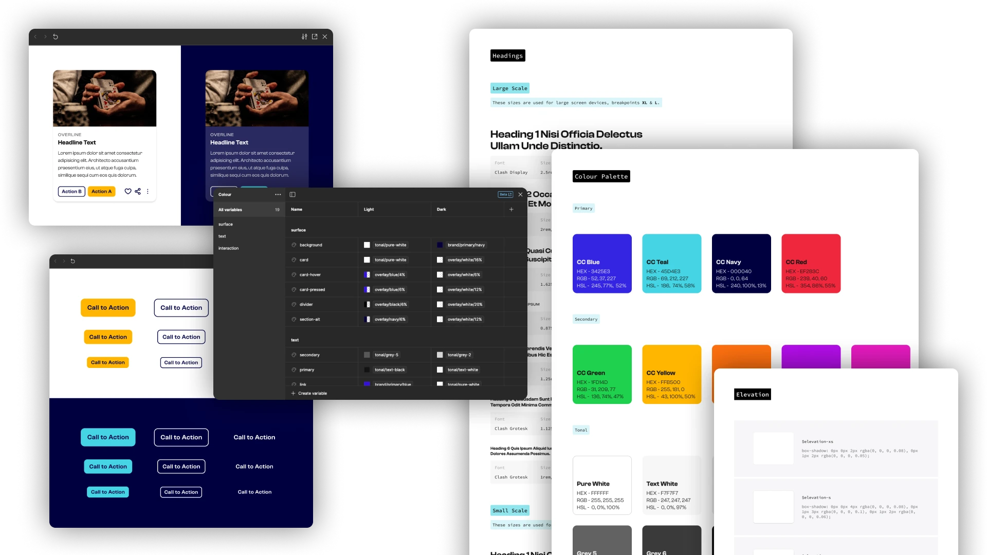
The main piece of work during the launch was to update our design system. I had already been systemising our components and design tokens during the previous projects but it was still somewhat disjointed and difficult to navigate. I took this as an opportunity to improve the overall structure and presentation, creating component demos and using the latest figma features, rather than just updating what we already had.
These updates split the old system into separate files for easier management, and loosened the strict atomic structure we had to streamline finding and using components. Using Figma’s latest features also enabled a quick way to set up light and dark UI modes which was a very popular community request.
To manage the work needed to get this live I defined a phased launch plan, starting with social media and the community, then updating basic site assets, and eventually a full product restyle.
The community launch went well, with the Canva library I built enabling forum mods and admins to create brand assets without the design teams direct involvement. Unfortunately the full restyle has yet to launch due to structure changes at iTech & Legend, however the work delivered will ensure the team can roll out the new look with minimal friction.
Have a project you’d like to collaborate on? Get in touch at dan@dan-marston.co.uk