Have a project you’d like to collaborate on? Get in touch at dan@dan-marston.co.uk
© Dan Marston 2024
The experience had not been updated in over 10 years, and it was very much showing it’s age. It also did not have a structured design team to guide any change, only having a part-time contractor focused on marketing assets. Work had been underway to define the overarching product strategy and it was my task to build a design team and define our vision for what Replay could be, and deliver updates across iOS, Android and web.
With the support of the head of product and my design and research colleagues I set about creating a vision document, outlining our overall goal for the product, the process improvements we needed to make and the design strategies we would take to improve the metrics set out in the product strategy. The primary objectives of this document were to inspire the team and provide solid foundations on which to build.
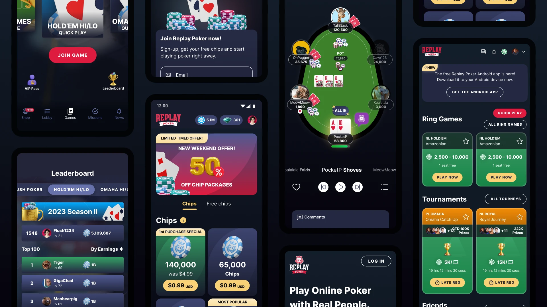
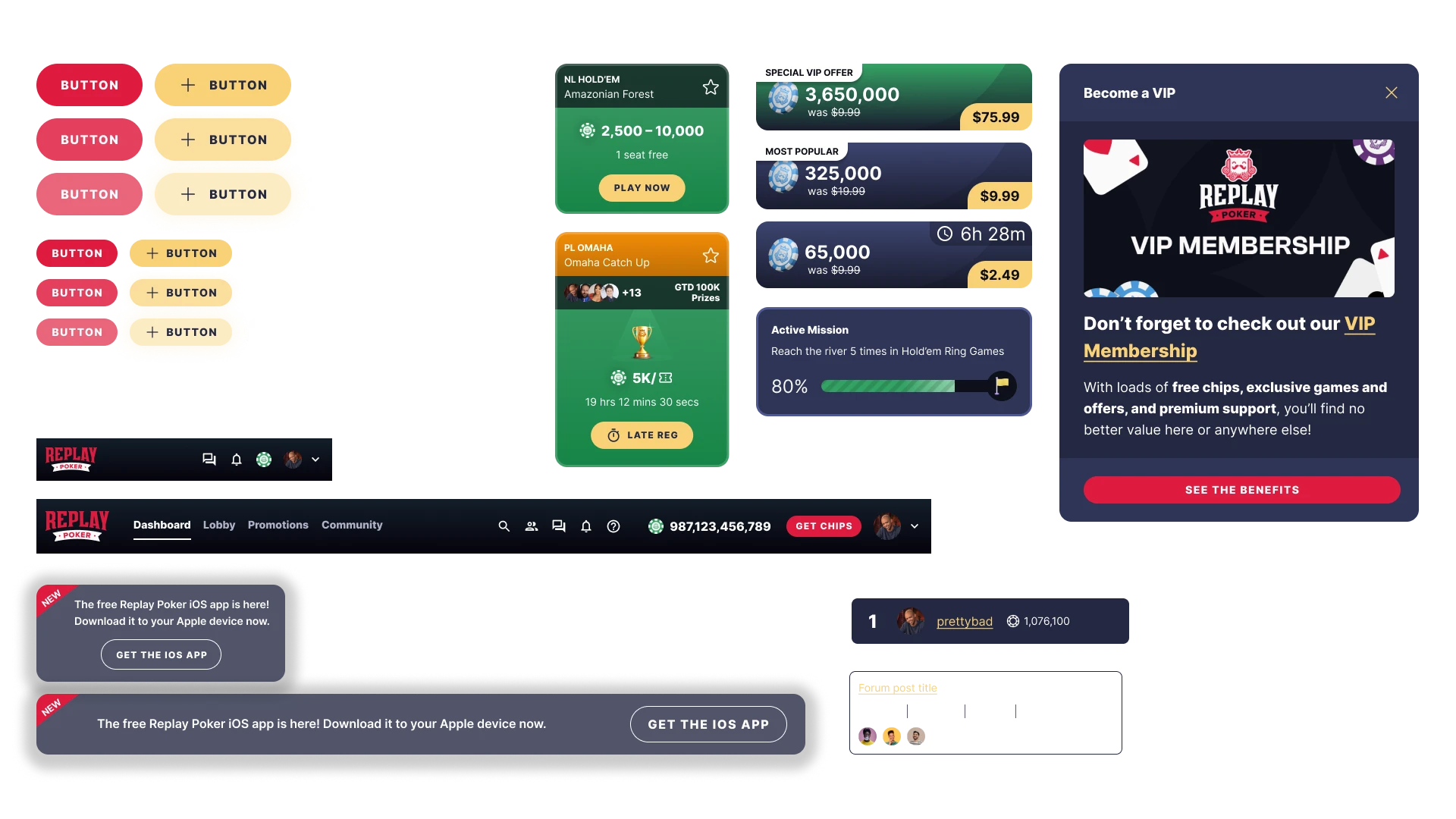
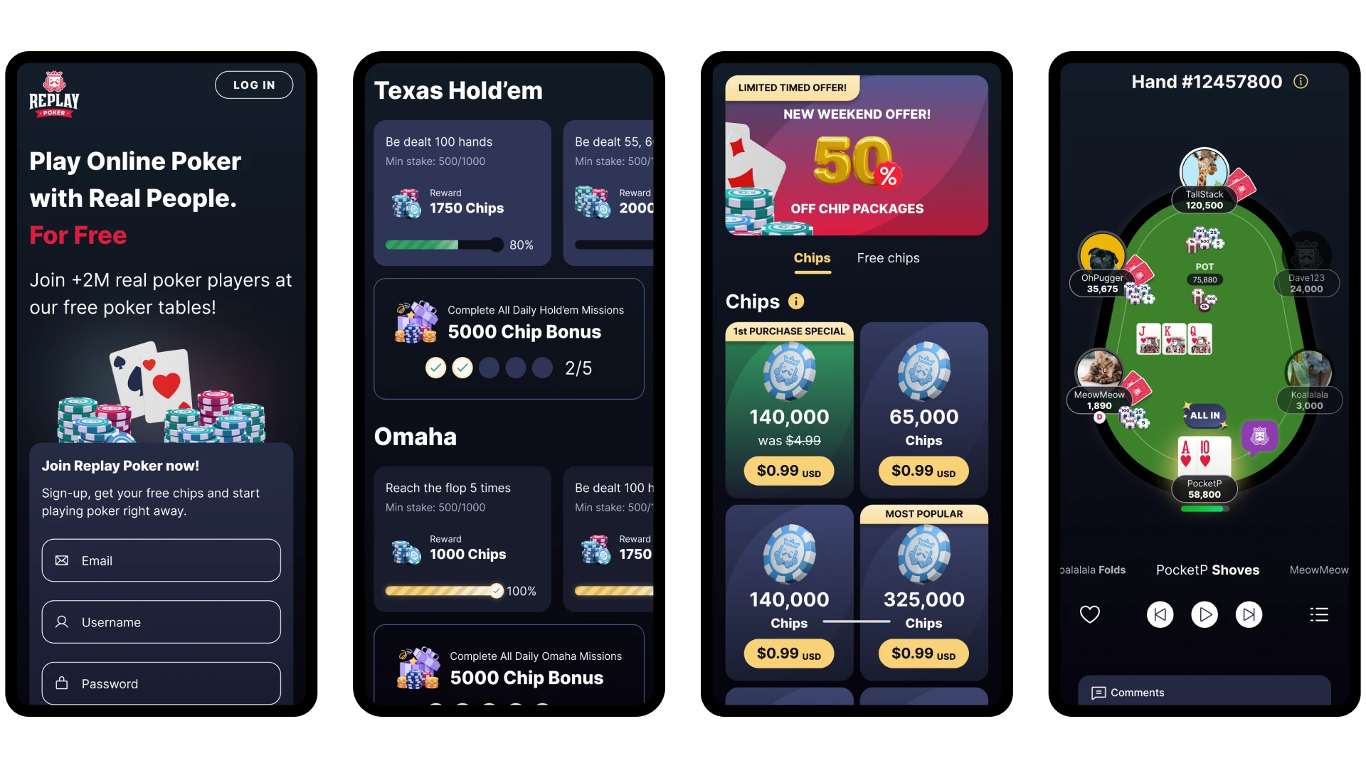
After starting with installing collaborative and structured processes for the design team, such as prioritisation sessions with product, engineering and marketing, establishing a backlog and refinement sessions, and regular design and research syncs, we began to audit the site and build a design system. The aim was to create a unified design language that we could roll out site wide, laying the foundations for future feature enhancements.
Various directions were explored, and based on internal feedback and qualitative research we conducted with players, a direction was chosen. I worked closely with the engineering team gathering their feedback, which lead to adjustments for consistency and technical limitations. I also worked on various interactions such as site search and modal behaviours which had not been outlined initially.
Throughout the process there was a big focus on accessibility, something that was not a consideration in the old design, with many font sizes being way below the acceptable threshold and certain colour contrasts not being high enough. We ensured that these issues were addressed to improve the overall experience.
The redesign was initially launched to 20% of users, rising to 50% after the first week. The testing showed improvements beyond our expectations. While the core experience had not fundamentally changed, this upgrade had a positive impact on all our key metrics; time spent playing, new user retention, first time purchasing and average revenue per user.
One of the larger style changes was to draw much more attention to the tournament quick play interaction with the addition of a trophy image and spotlight hover effect. Historically tournaments had been seen to drive player retention, so the focus on improving this was seen to have driven a lot of the increase in this metric.
We ensured we were also listening to qualitative feedback from our players, and set up a thread in the forums to gather their feedback. Based on this, adjustments were made to improve certain areas.
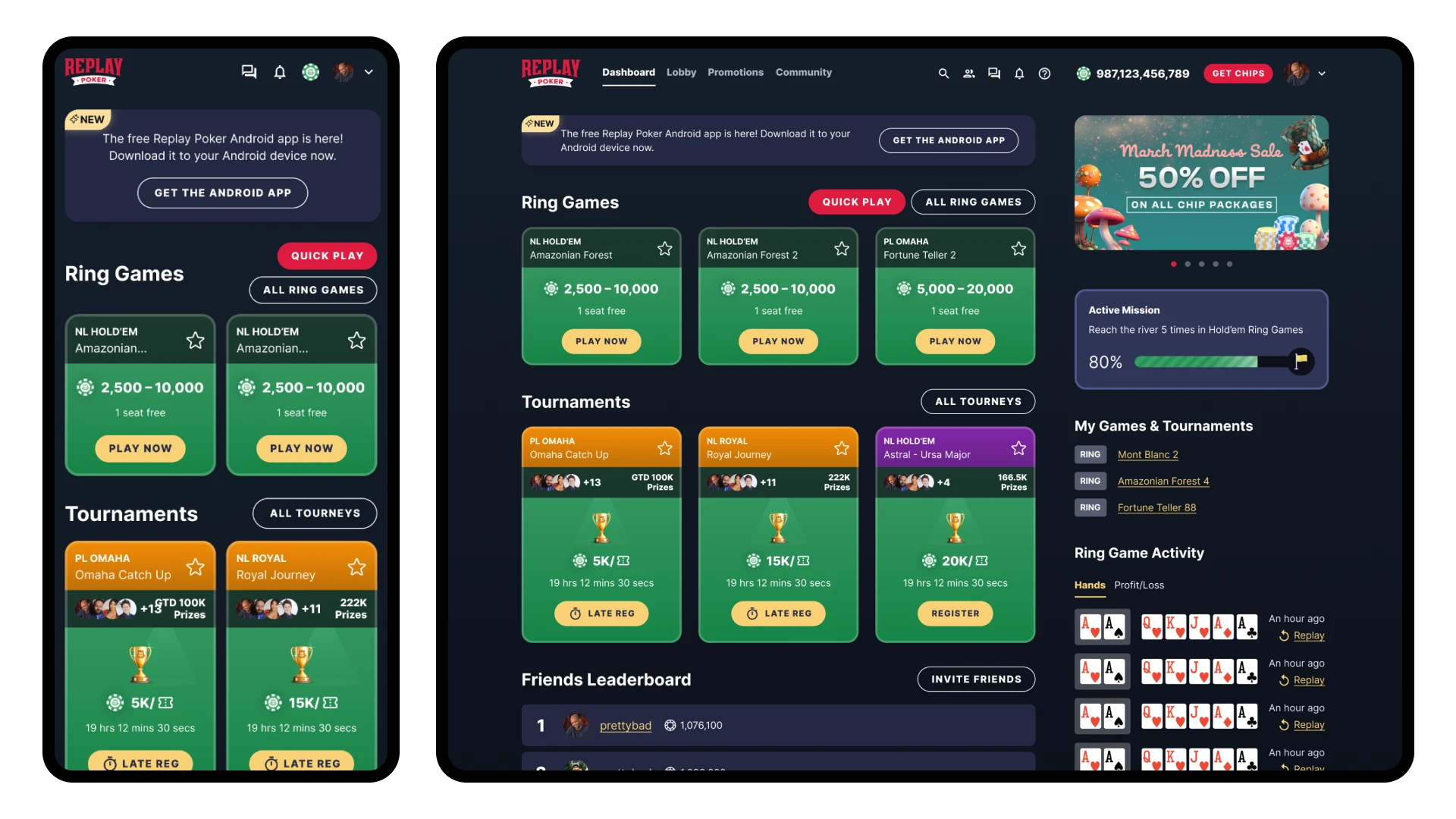
Building on this redesign work the design team could now start creating concepts and test variants to enhance what had been launched. We worked closely with marketing to ensure the assets we supplied to them were more on brand, and new landing page templates were designed for the acquisition team, that made there output more consistent while providing flexibility for different targeting.
We started to optimise our bank page, the primary commercial area of the app, exploring different currencies and consumables to expand the gameplay mechanics. This also led to a redesign of a more recent feature, Missions. This helped embed them in the overall experience more seamlessly, allow more flexibility when it came to rewarding payers, and also expand the game types in which they were available.
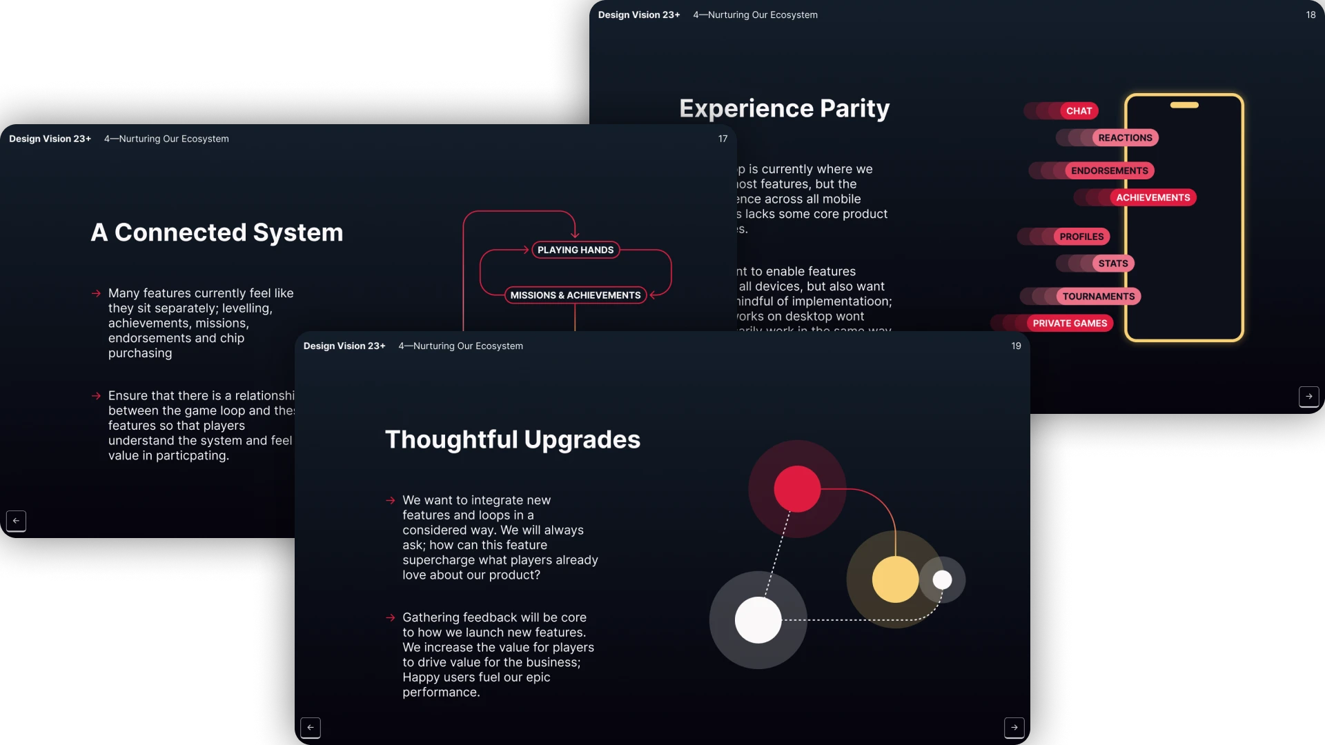
I also made sure the design team were taking time to explore bigger, more expansive enhancements by setting up seasonal focus weeks. Examples of the outputs of these were the complete rethink of the hand replayer functionality, and a redesign of the app experience. These projects were shared with the company to inspire and generate discussion, and ultimately influence the roadmap.
Have a project you’d like to collaborate on? Get in touch at dan@dan-marston.co.uk